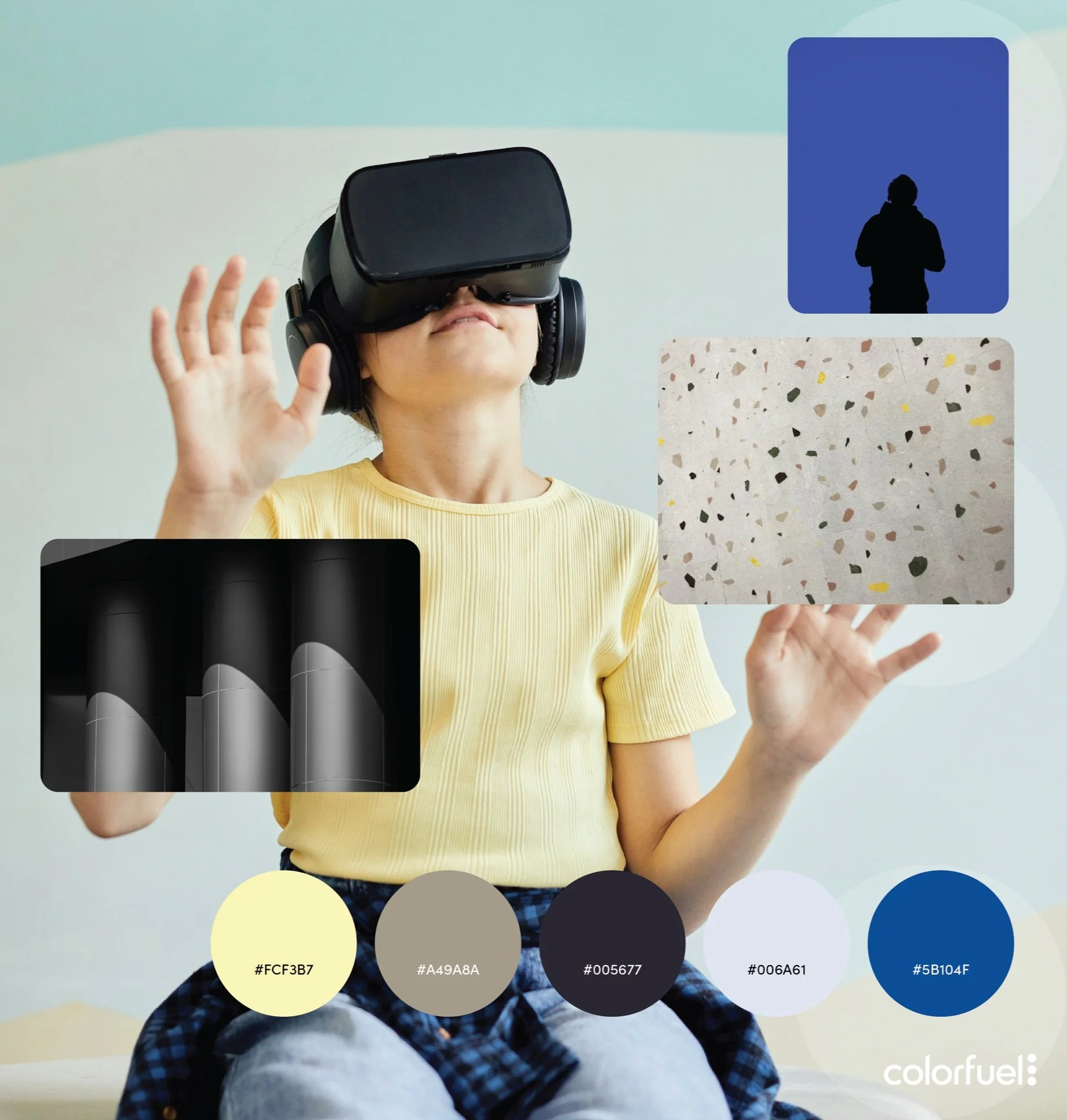
Color Signals 2025, Story 3
Story #3 of the Color Signals 2025 forecast is TruLie. This is only one of the four stories that were created to bring the 2025 forecast to life. Contact me if you would like to see the full report, at no cost, or if you would like to pursue a forecast for 2026-27. 2027 is already on the radar as it should be for most product and marketing planning right now.
Trend forecasting is an ongoing process and while there are seasons for forecasting events like Color Marketing Group’s ChromaZone workshops, my process continues all year long. As any forecaster will tell you, we are watching, listening and capturing the insights all of the time. I have a framework of historical influences and drivers for color/material/finish trends and that is the touchstone for ongoing observation and tracking. Most of the work is industry-inclusive, meaning I don’t limit it to any particular client or product. Once the basic bones of the forecast for the year are pulled together it can then be tailored to my client. These insights are not the directive for palette development but they are integral to understanding the end consumer and their future purchasing behavior.
TruLie
TruLie emerges from a dissonant cultural moment—one where the abundance of information has paradoxically left us less certain. As the lines blur between fact and opinion, the public grapples with a sobering realization: access does not equal clarity. In a world shaped by conflicting narratives, algorithmic bubbles, and manipulated truths, trust has become a fragile commodity. Governments and corporations are viewed with skepticism. Social media amplifies both progressive ideals and reactionary backlash. The push and pull between free speech and harmful misinformation has become an ever-present tension—no longer abstract, but deeply personal.
The term “woke,” once a symbol of awareness and social responsibility, has become politicized and polarizing. Those advocating for progress are often met with suspicion, even hostility. Meanwhile, the rise of AI intensifies these challenges, as synthetic voices and deepfakes distort the already murky waters of public discourse. Amidst the confusion, people are demanding transparency, authenticity, and accountability—not just from institutions, but from brands, media platforms, and even one another. The truth is no longer taken at face value. It must be earned.
Despite the darkness of this narrative, there’s also resilience. In our collective questioning, we’re cultivating a new kind of awareness—less naive, more discerning. People are learning to hold complexity and contradiction, to sit with discomfort, and to resist the lure of simple answers. This is not a trend of despair—it’s a call to vigilance and conscious participation.
Color Direction
COLOR DIRECTION
The TruLie palette reflects emotional complexity, the contrast between clarity and confusion, and the harsh light of reckoning.
• Sharp contrasts between light and dark tones symbolize truth versus distortion, transparency versus shadow.
• Cold, grounded neutrals—like slate gray, tarnished silver, and stormy beige—convey a sense of realism and emotional weight.
• Punctuated chromatics—acid yellows, static blues—mimic moments of urgency, shock, and digital noise.
• Desaturated tones reference memory, distortion, and nostalgia—often twisted or repurposed in modern discourse.
• Synthetic effects—metallics and pixelated or layered textures—hint at tech interference and blurred realities.
This is a palette of emotional ambiguity—neither warm nor cool, neither comforting nor entirely alienating. It's designed to provoke thought and mirror societal tension.
Consumer Goods
Fashion
Home Interiors
APPLICATION POSSIBILITIES
Consumer Goods
Tech & Devices: Monochrome finishes with glitch accents—think matte graphite with iridescent inlays. Products reflect anonymity and digital duality.
Packaging: Transparent materials over opaque graphics, layered effects, and purposeful disruption in type and layout to reflect questioning and decoding.
Personal Care & Wellness: Dark, moody packaging with honest, raw messaging. Colors reflect inner work—burnt mauves, bruised plums, dusty taupes.
Fashion
Apparel: Anti-hero aesthetics—structured, deconstructed, and modular silhouettes in unsettling yet alluring tones. Storm gray, oxidized copper, tech blue, and murky black take center stage.
Streetwear & Youth Markets: Bold juxtapositions: harsh light colors with corrupted prints or pixelated elements. Hoodies, vests, and oversized layers create a protective, questioning silhouette.
Luxury & Conceptual: High-contrast looks—icy silvers with deep onyx, acidic yellow with raw canvas neutrals—mirror the tension between exposure and concealment.
Home Interiors
Color Blocking Walls: Dramatic contrasts—one side near-black, the other chalk white—dividing space like ideological lines.
Textiles & Upholstery: Synthetic sheens paired with nubby textures. Glitch-inspired woven patterns and screens with semi-transparent overlays create visual distortion.
Accent Decor: Mismatched lighting (cool LEDs vs. amber bulbs), disrupted forms, and mirrored or surveillance-inspired design features.
This is only one of the four stories that were created to bring the 2025 forecast to life. Contact me if you would like to see the full report, at no cost, or if you would like to pursue a forecast for 2026-27. 2027 is already on the radar as it should be for most product and marketing planning right now.


