
How to Choose Color in Branding

A few months ago I wrote this as a guest blogger for Neon Lizard Creative and if you want to see it there click here.
There is no “easy button” when it comes to choosing colors to represent a brand. If you google “color in branding” there is plenty of advice out there that attempts to explain color psychology and symbolism. Think of this as only your starting point. I believe most marketers understand the importance of color and the power of color in branding. Color touches us emotionally and is a dynamic tool to connect with customers.
It is one of the most critical decisions in logo design.
The colors chosen must convey the personality of the brand in unison with the design. I say colors, plural, because it is seldom a single color when developing a brand strategy. Also, there is the current trend for more dimension in logos which requires more color and/or gradations.
As you likely have recognized, there are some companies that have so successfully marketed their brand that one could say they own the color. A few have even gone so far as to trademark their color.


But back to the strategy. When developing a brand strategy or the story of your brand, you are looking at the logo, the fonts, their placement and use, stationary, social profile and more. What is the color that best represents your brand personality? The color, in tandem with the design of the logo, should:
1. make you easily recognizable
2. help you to stand out from the competition
3. increase your profits
Once you have done the homework of identifying what your brand personality is, you probably have some descriptive words for your brand. Looking at those, you may already be thinking of colors that you think represent the traits. You will need to pick one core color and several supporting colors.

Starting with the most basic color psychology information will give you ideas about how certain colors can trigger emotions and you can use that as a guide but keep in mind there are so many other factors at play. For example, a coffee shop might logically use a brown as it speaks to earthy simplicity and trust.
Starbucks shifted another direction with green and no one can argue with their success in branding.

You can read up on the many facets of color psychology to understand the basic emotions that certain colors can evoke but often the superficial study does not take everything into account, such as the saturation levels, the value or light/darkness of the color or how it interacts with other colors. A pale baby blue doesn’t speak the same way as a dark navy blue. Also, color is so personal, and our history and experiences can impact how a color affects us. Pay attention to those general cultural and age preferences. There are some important considerations within color families that are very different depending on the audience. For example, whites in some cultures symbolizes cleanliness, humility, and innocence while in other cultures it is the color of death and mourning. That’s not to say you can’t use white, obviously Apple has used it quite well.
Consider the context of the application and focus on doing that well.
Step number one is to fully understand who your target market is and what the color will say to them about your brand.


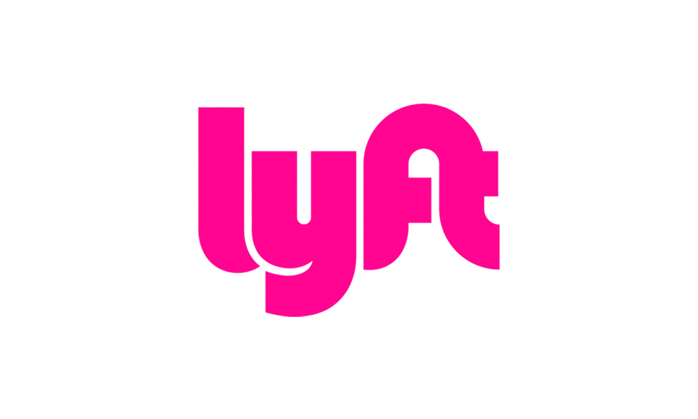
Differentiation is another factor to keep in mind. If you are a financial institution and all the banking brands are using blue because it represents security and trust, then you might want to choose something different to stand out like Ally. T-Mobile’s magenta is an outlier color in the cell phone category and lyft’s pink is eye-catching and appeals to their younger target market.

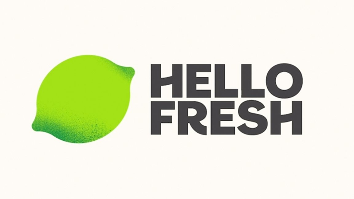
Shifting Cultural Perceptions is another component of the selection process to keep in mind. If you look at the general psychological attributes for green, for example, it was not a color that food-related brands would have considered in the past. Today with health and wellness having such an influence on that market, green has become quite a popular player in branding color schemes. It became a differentiator for those food brands wanting to be identified as healthier.
And remember the cultural disparity with the color white? This could be shifting as well as the internet shrinks our world, we see younger generations viewing color in a way that is quite different than their parents.
Some brands may stick with black or white as their logo which can make sense as these examples show, however having a color palette as part of the brand strategy to work with these is still imperative.
So, it seems that there are plenty or “rule-breakers” when you look from the psychological perspective. I believe the examples illustrate that color can be complicated – we are humans who are utterly complicated ourselves after all. The application of the color is the key. Thinking through the placement and tying the color choice to the brand personality.
The logo should be able to stand alone, but in many instances, it will be in play with other colors so those need to be defined. Choose colors that will complement and enhance the viewer experience. Consider the color of the paper if the logo is printed or the background color on the website. The call to action or accent colors are also key components. These are all moments to make strategic color selections.
My business is Colorfuel and we know that color feeds the soul and once understood color is your most powerful fuel.