
But is it Ugly

Category: so ugly that it is cute!
Such a harsh word, ugly. When choosing a color, we certainly wouldn’t choose one that we consider ugly, would we? What makes a color ugly, and is there such a thing? On the positive side, could I pick a favorite or most beautiful color? Well, that is like asking me which is my favorite child! But truly, can I say that any color is the worst one? How we develop preferences is an interesting topic that you can dive into with this more scientific research article, “An ecological valence theory of human color preference.” It explains how our preferences are developed over time and based on experiences.
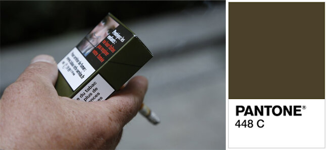
Setting aside the timing and trend aspect of color preferences and focusing strictly on personal predilections, I’m most interested in those colors we do NOT prefer. One such color that was deemed “officially” as the world’s ugliest color is Pantone 448C. A few years ago, the Australian government hired researchers to find a color and develop new packaging for all tobacco products to make them as repugnant as possible – in other words, ugly. This dark drab olive green was their choice. Reportedly, it worked, sales went down after the new packaging was implemented and several other countries have followed suit. Story here.
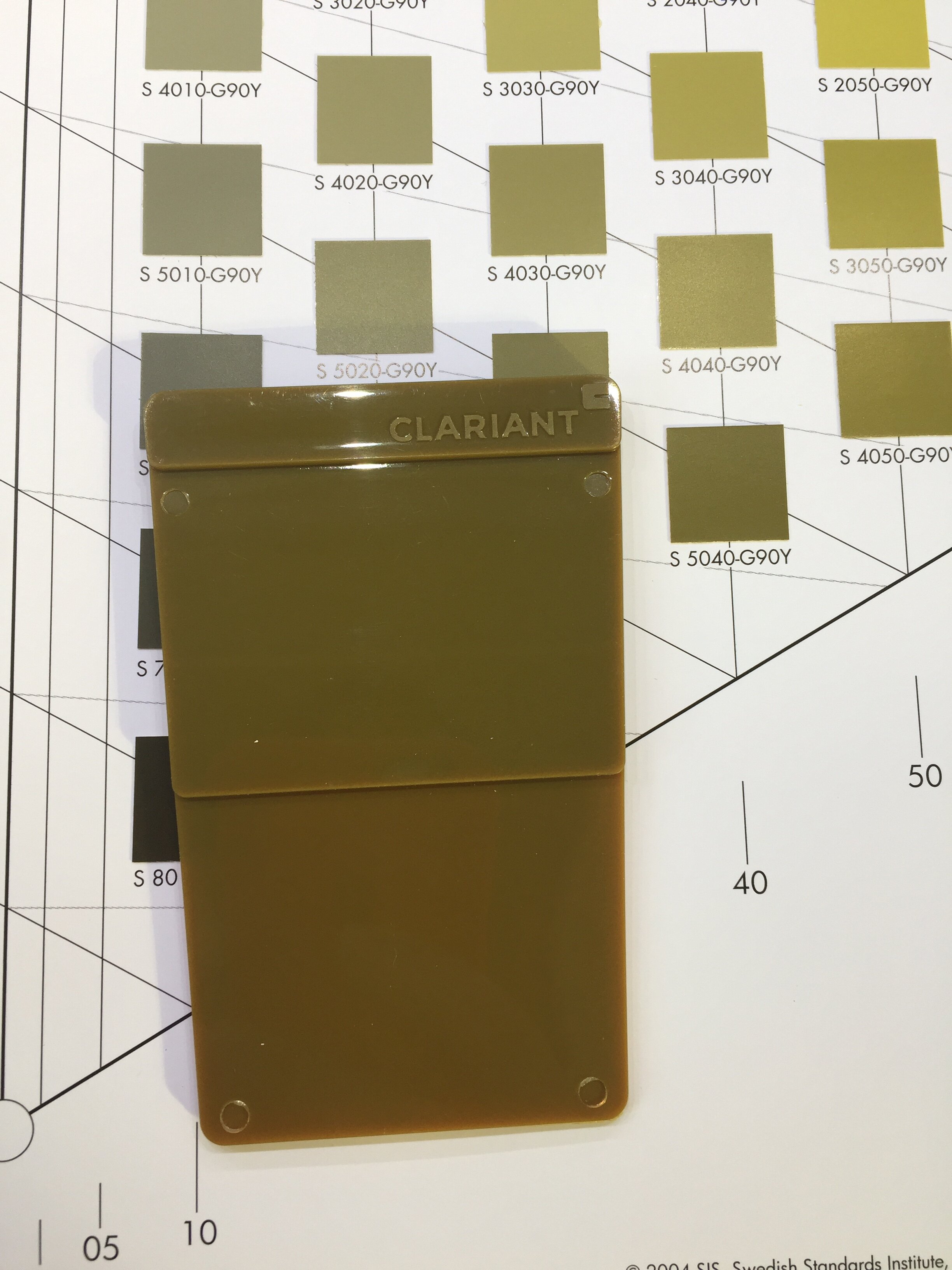
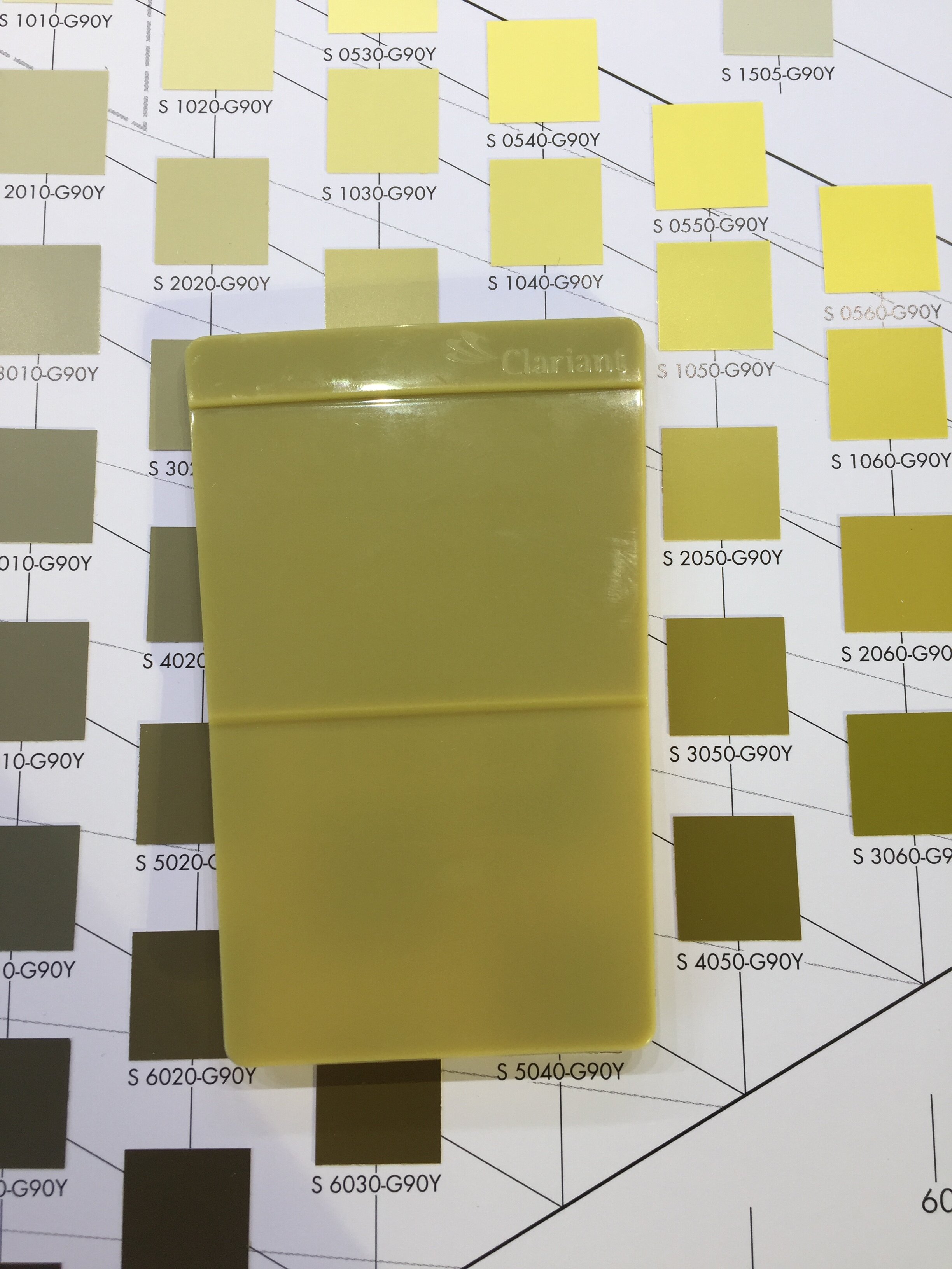
The consensus of my informal poll of fellow color professionals was that we all hesitate in assigning that title to a color. Judith van Vliet, senior designer, ColorWorks EMEA at Clariant and Immediate Past President of Color Marketing Group (CMG), felt it was super subjective, but generally mixing colors that result in beige/brown/mud tend to be disliked. She had two forecasted colors that she dislikes. One was a dark green called Primordial Soup. It’s a brownish-green that prompts references to sewage and death. It looks quite a bit like the Pantone 448C mentioned previously. On the flip side of those very negative descriptions, Judith says that with a metallic effect she could see the color working well in an automotive application and she might actually like it there. Another color she dislikes is Satori Green, considering it a dull, no emotion, unclear and dirty color having no character. But then again, after further thought, she determines it is one that would result from recycling various colors of PET bottles…so promoting sustainable packaging…maybe it’s an option after all. Bad can be good.
A rebel color you might say.
Lora Di Fabio, Design and Development Manager, Flooring with American Biltrite and CMG Board of Director, finds the combination of green + yellow + black to be off-putting. In her words, “it just looks icky to me. In French, the colour is called kaka d’ oie, which translates to duck poo!”

This NCS color is quite similar to the Pantone hue and Primordial Soup.
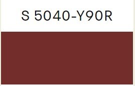
Montaha HIdefi, Color Archeologist, Author, Writer, CMG VP of Color Forecasting, chose the color maroon. Simply put, the color to her connotates dried blood.
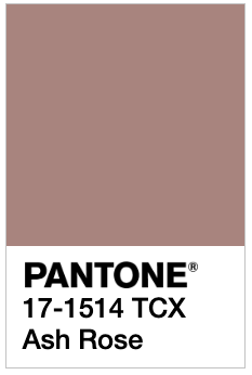
Paula Leonard, Color Material Finish Designer and Trend Visionary with Hü Designs, CMG VP of Marketing said that while she was flipping through her fan deck of colors, she truly felt there could be a good use for just about any color. She did have a few that she could say were her least favorites with Pantone TPX 17-1514 being at the top. Interestingly to her was the fact that this color was in the same family as Pantone’s Color of the Year 2015 Marsala which she hated…maroon again! She thought she would have picked a “poo green or yellow” but kept coming up with ways to use them. Those dusty roses, “I just really don’t like ‘em!”
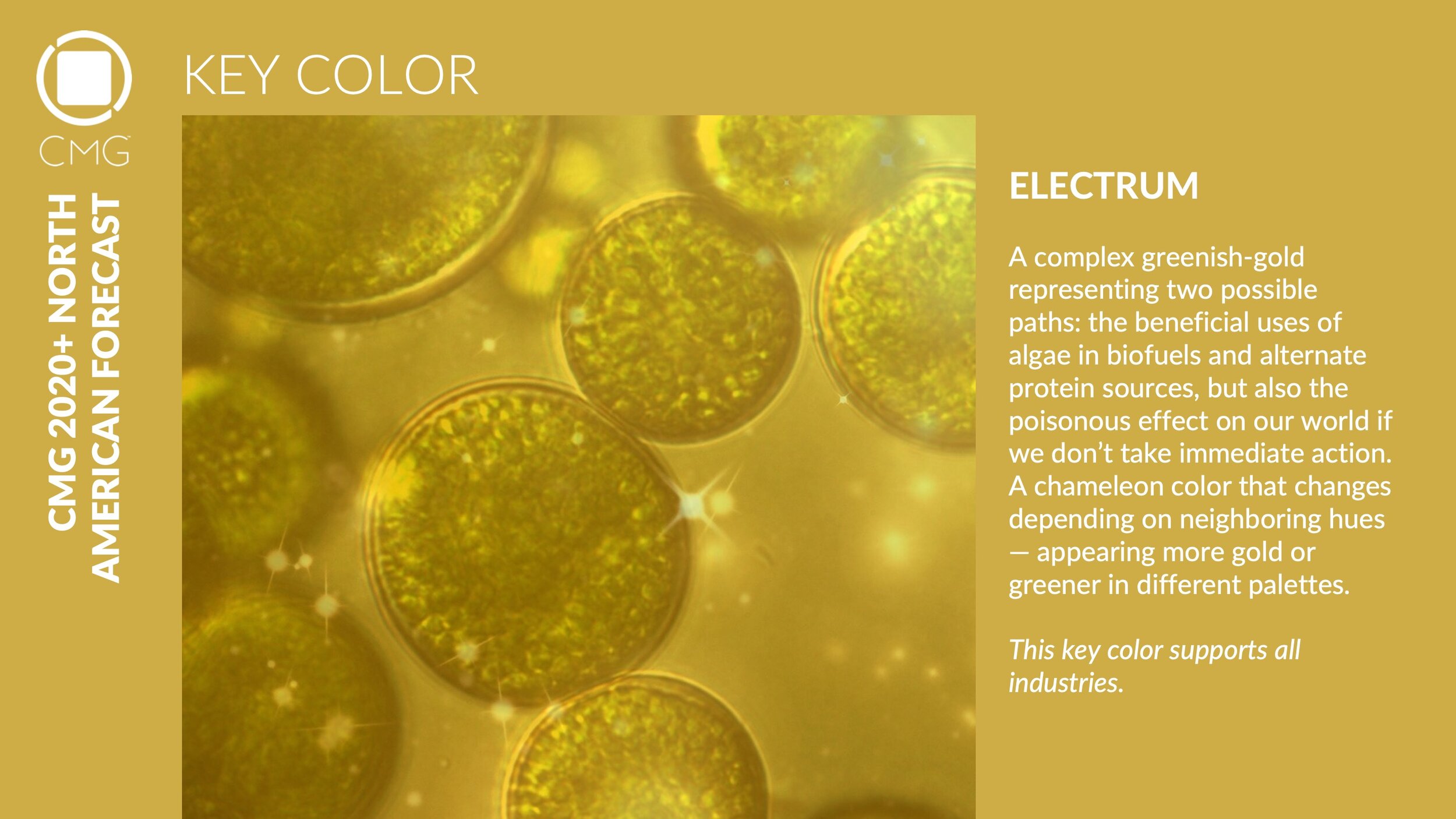
Susan Hayes Hoover, Designer, Project Manager at Neon Lizard Creative and CMG VP of Membership said that her least favorite color is Yellow. “I don’t own any yellow apparel, accessories or home décor items. When buying annual flowers, I never choose yellow. But I would not call it an ugly color. A color I dislike and think is truly ugly is CMG’s North America Key Color for 2020, Electrum (sorry VP of Color Forecasting!). I have always disliked Chartreusey colors. I’m not sure I can say why. Could it be the association with baby poop? Or could be that it just looks dirty. A good color gone bad, slightly rotten, impure. A bad seed.” Not to worry CMG color forecasters, nobody said a key color has to be pretty; it’s all about the power of the color, which we will get to later.
My daughter is a huge fan of yellow and while I appreciate it’s sunny disposition, it’s sadly not a color that looks good on me and similarly to Susan I find it a little too attention-seeking in home decor. So far, I can’t disagree with the statements made about any of these colors. Everyone has a valid yet personal reason for their dislikes.
Sam Greenspan had some pretty hilarious color descriptions in “11 Ugliest Colors in the World.” Beige he felt evokes these things; discoloration, internal organs that may or may not be healthy, bad teeth, your coworker’s pants from Old Navy. Lime Green evokes mucus, infection, and BP. Faded Salmon evokes the circumference of a pimple, flavorless fish, what it looks like if a fingernail gets ripped off. Bright magenta is a color he considers to be eyes-hurting, like frozen yogurt with Nerds mixed in, and a middle-aged female art teacher’s shawl. And there are more if you want a good chuckle, check it out.
Alicia Keshishian, Creative Director at Alicia D. Keshishian/Chroma•licious, CMG Board member, shared her thoughts on brown. “While I know all colors have a place and can be beautiful depending on the circumstances I have a total aversion to many browns. I find they are usually chosen out of lack of spirit. They feel lifeless and lacking soul. They are particularly offensive on houses/buildings. Talk about lack of spirit…! These pics were taken on my walk home ~ only a few blocks, and every time I pass these buildings I get so sad. They are all similar though it doesn’t really show in the pictures.”

My fellow CMG Board member Roz Kavander, Color Design and Trend Consultant with Roomworks shared a few thoughts. “If I am looking for clothes, man, I can point to a million ugly coloured items, but they are mostly ugly because they wouldn’t suit me, or the colour is inappropriate for my needs …. golden yellow for a funeral …. or the combinations are hideous, or the pigments are cheap or the fabric fibres would only dye into certain colours …. so, wait! ….those are ugly colours … but then again maybe not if they were somewhere else….but what do you call those poor colours stuck on polyester leisure suits … failed fabric colour attempts…. I think. In fact, a lot of colour gets a bad rap from being forced into fibres that are not wishing to make their acquaintance. Just saying…. And combinations…. trying to combine colours without considering undertones …. now don’t get me started!!!!! Putting colours beside other colours they do not get along with is like being in the middle of a spectral curve war!!!!!!! Let’s talk about pink beige next to yellow beige …. then again let’s not.
Pink beige is an ugly colour…. no, wait a minute I just did a bedroom for a client in pink beige and I loved the finished result. Gorgeous. No, I like Pink Beige …. just not in my house but wait a minute it might look great with those curtains in the guest room ….hmm. Peggy, I cannot think of an ugly colour because I would always be able to find a situation where that poor colour would look great and then I would fall in love with it. But as CMG says …. The Right Color Sells. So, I guess as a color you only get ugly when you are in the wrong place at the wrong time.”
Going back to the struggle for those who feel that they cannot call a color ugly, Sandy Sampson, Creative Director, and Color Consultant at Simple Modern Style, CMG VP of PR and Communications, says, “All color is beautiful in the right context, combination or lighting. It is person’s preferences that deem a color ugly. Like art, what one person sees is not the same as another.” Pink is the least favorite color for her only because she had a pink room as a child and did not want pink. “It is not because pink is ugly but because I don’t care for the hue personally. Kind of like rescuing a dog, they come with baggage and it takes time and effort to change their past.”

The blog apartmenttherapy.com had a couple of posts that I found interesting showing some examples of so-called ugly colors and how to make them work. Olive green is the ugly duckling they work with in the image below.

Red and Green are the trouble-makers below. Who would dream of breaking the rule of using red and green together without it looking Christmas-ey! Proof it can be done, it’s all about the complexities of color - hues, values and saturation make all the difference.

(Image credit: Jake Curtis)
I guess I can summarize by saying that we all know a word like ugly is subjective. Our color choices are about taste and preferences that are developed over time based on memories, psychology, experiences and our color vision. We have all experienced a color clash or misapplication of colors that made us stop and notice – and not in a good way. But then we see the value in that disharmony, as it’s another example of the Power of Color.
Rebel-ugly colors for the win!
Colors can make us feel good or bad or just notice something. Understanding the color complexities, trends and timing, and studying human behavior as it relates to color is all a part of my process. Harnessing that power is fun!