
Magic Not Mystery
I often say that color is magical. I want to be clear though that the magic is in the power that it has, to influence and affect us. It is not mystical or mysterious in how it does this. There is a component of our brain that responds to color and along with that, our color vision, our memories and experiences also play into the magic. Rather than being mystified by it, we can learn more about why certain colors affect us differently and then how to combine those colors in a way that is harmonious and applicable to the situation where they will be used. Ultimately my hope is to reduce the fear in making color decisions for my clients to offer the best selection of colors and well, anyone, to embrace color in their lives and to use its power to benefit their wellbeing.
Much of the magic that we see in color is the harmony of certain color combinations. As I play with combining colors, or make observations in my surroundings, I will hit on certain groupings that simply sing!
I spotted this bedroom on the blog at Sincerely Sara D
Why did it strike me? First, I love the blue-green wall color but paired with the purples and the navy and the pinks and the cream and the gray – it is win-win!! My eyes flow through the space and it sets a mood of calm yet playful. The largest proportion of wall color is allowed to shine but the sprinkling of strong and dark colors adds interest. There is a balance that is achieved with the creamy neutrals. Even the sparkle of the metallic accents adds some interest and contrast to the soft textures.

Image: Sincerely Sara D

Another example here using color with neutral gray and natural light wood. Getting the neutrals from the right color family makes all the difference in making this combo work. They are based in the yellow-green family and coordinate perfectly with the warm, yet grounding gold.
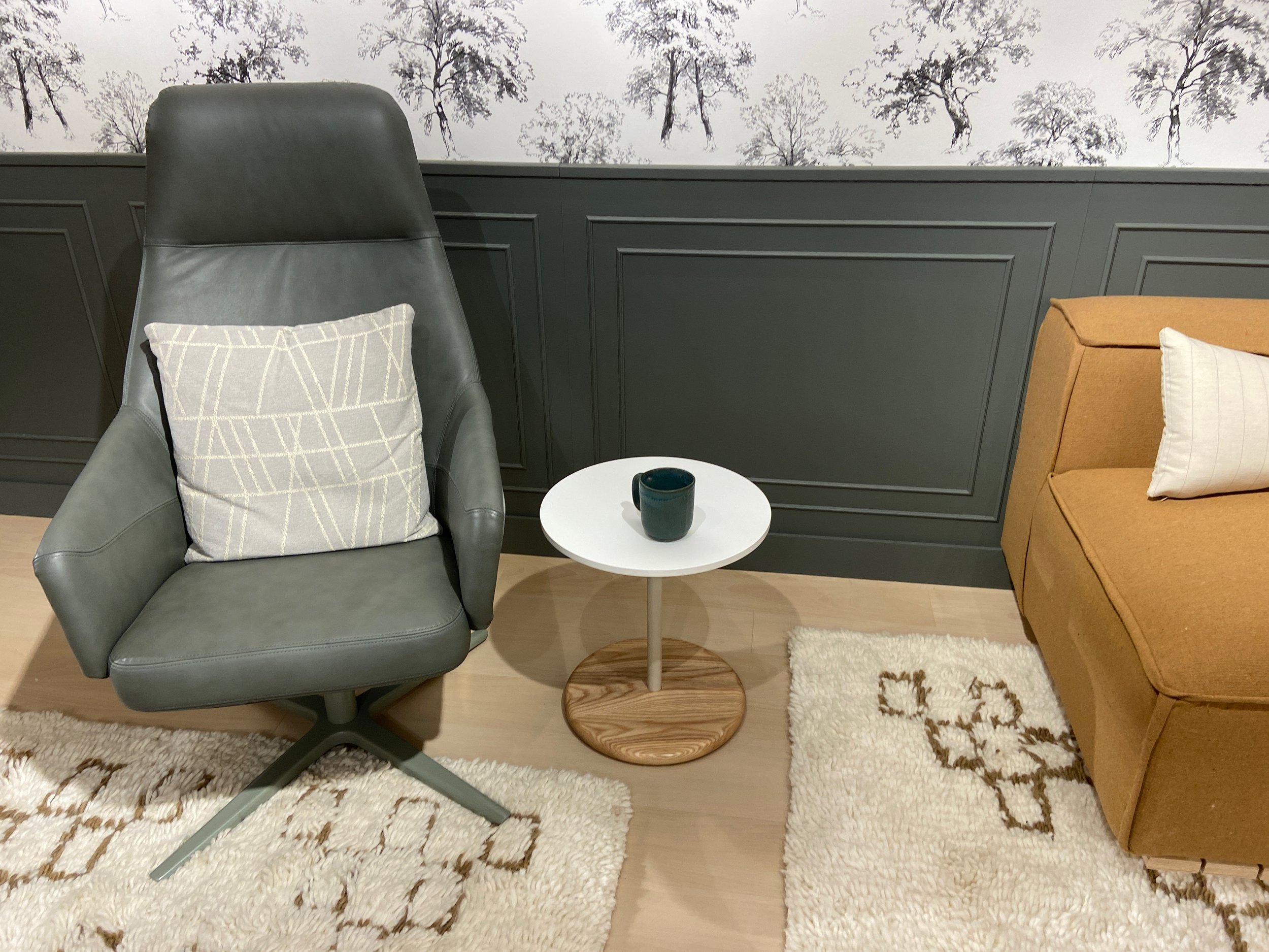
Image: Peggy Van Allen at NeoCon 2022 OFS showroom

Nature provides endless opportunities to be inspired by colors in combination. There is intensity in the saturation levels but also the grounding depth of the green and the bits of lighter and less saturated colors, giving the eye a place to rest.
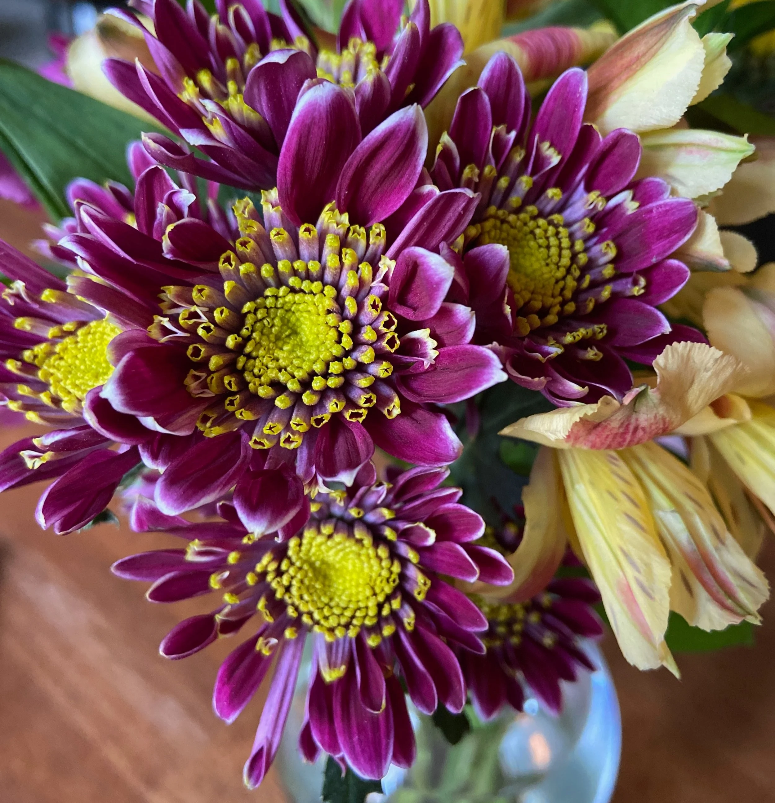
Image: Peggy Van Allen
There are many sites to explore color psychology but I do want to note that these are generalities and there are so many other variables that need to be considered. The number one variable is that color is personal and we all respond as the unique human beings that we are.

This is one site to explore color psychology:
https://londonimageinstitute.com/how-to-empower-yourself-with-color-psychology/

Another site with nuggets of information:
https://www.verywellmind.com/color-psychology-green-2795817
Image: Verywell / Cindy Chung
I could go on and on with more fun color combinations but I think you get the idea.
In future posts, I hope to share more concepts about color and its application. I think the more we know about color the more comfortable we are in making color decisions. One topic to explore is color’s usefulness in drawing attention or guiding our eyes throughout a design or space. Or understanding why and how different factors like finishes and lighting can shift our perception of a color’s appearance. More thoughts for another day. In the spirit of not rambling on, I will conclude with the simple idea that experiencing the magic of color is a gift that we all can cherish.
If getting the right colors or selection of colors is important to your business (and isn’t it always important?!) then Colorfuel is here to guide you.